
diff options
Diffstat (limited to 'content/blog/2020-09-25-happiness-map.md')
| -rw-r--r-- | content/blog/2020-09-25-happiness-map.md | 225 |
1 files changed, 225 insertions, 0 deletions
diff --git a/content/blog/2020-09-25-happiness-map.md b/content/blog/2020-09-25-happiness-map.md new file mode 100644 index 0000000..c55552c --- /dev/null +++ b/content/blog/2020-09-25-happiness-map.md @@ -0,0 +1,225 @@ ++++ +date = 2020-09-25 +title = "Data Visualization: World Choropleth Map of Happiness" +description = "Exploring and visualizing data with Python." ++++ + +# Background Information + +The dataset (obtained from +[Kaggle](https://www.kaggle.com/unsdsn/world-happiness)) used in this +article contains a list of countries around the world, their happiness +rankings and scores, as well as other national scoring measures. + +Fields include: + +- Overall rank +- Country or region +- GDP per capita +- Social support +- Healthy life expectancy +- Freedom to make life choices +- Generosity +- Perceptions of corruption + +There are 156 records. Since there are \~195 countries in the world, we +can see that around 40 countries will be missing from this dataset. + +# Install Packages + +As always, run the `install` command for all packages needed +to perform analysis. + +```python +!pip install folium geopandas matplotlib numpy pandas +``` + +# Import the Data + +We only need a couple packages to create a choropleth map. We will use +[Folium](https://python-visualization.github.io/folium/), which provides +map visualizations in Python. We will also use geopandas and pandas to +wrangle our data before we put it on a map. + +```python +# Import the necessary Python packages +import folium +import geopandas as gpd +import pandas as pd +``` + +To get anything to show up on a map, we need a file that will specify +the boundaries of each country. Luckily, GeoJSON files exist (for free!) +on the internet. To get the boundaries of every country in the world, we +will use the GeoJSON link shown below. + +GeoPandas will take this data and load it into a dataframe so that we +can easily match it to the data we're trying to analyze. Let's look at +the GeoJSON dataframe: + +```python +# Load the GeoJSON data with geopandas +geo_data = gpd.read_file('https://raw.githubusercontent.com/datasets/geo-countries/master/data/countries.geojson') +geo_data.head() +``` + +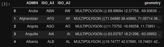 + +Next, let's load the data from the Kaggle dataset. I've downloaded +this file, so update the file path if you have it somewhere else. After +loading, let's take a look at this dataframe: + +```python +# Load the world happiness data with pandas +happy_data = pd.read_csv(r'~/Downloads/world_happiness_data_2019.csv') +happy_data.head() +``` + + + +# Clean the Data + +Some countries need to be renamed, or they will be lost when you merge +the happiness and GeoJSON dataframes. This is something I discovered +when the map below showed empty countries. I searched both data frames +for the missing countries to see the naming differences. Any countries +that do not have records in the `happy_data` df will not show +up on the map. + +```python +# Rename some countries to match our GeoJSON data + +# Rename USA +usa_index = happy_data.index[happy_data['Country or region'] == 'United States'] +happy_data.at[usa_index, 'Country or region'] = 'United States of America' + +# Rename Tanzania +tanzania_index = happy_data.index[happy_data['Country or region'] == 'Tanzania'] +happy_data.at[tanzania_index, 'Country or region'] = 'United Republic of Tanzania' + +# Rename the Congo +republic_congo_index = happy_data.index[happy_data['Country or region'] == 'Congo (Brazzaville)'] +happy_data.at[republic_congo_index, 'Country or region'] = 'Republic of Congo' + +# Rename the DRC +democratic_congo_index = happy_data.index[happy_data['Country or region'] == 'Congo (Kinshasa)'] +happy_data.at[democratic_congo_index, 'Country or region'] = 'Democratic Republic of the Congo' +``` + +# Merge the Data + +Now that we have clean data, we need to merge the GeoJSON data with the +happiness data. Since we've stored them both in dataframes, we just +need to call the `.merge()` function. + +We will also rename a couple columns, just so that they're a little +easier to use when we create the map. + +```python +# Merge the two previous dataframes into a single geopandas dataframe +merged_df = geo_data.merge(happy_data,left_on='ADMIN', right_on='Country or region') + +# Rename columns for ease of use +merged_df = merged_df.rename(columns = {'ADMIN':'GeoJSON_Country'}) +merged_df = merged_df.rename(columns = {'Country or region':'Country'}) +``` + + + +# Create the Map + +The data is finally ready to be added to a map. The code below shows the +simplest way to find the center of the map and create a Folium map +object. The important part is to remember to reference the merged +dataframe for our GeoJSON data and value data. The columns specify which +geo data and value data to use. + +```python +# Assign centroids to map +x_map = merged_df.centroid.x.mean() +y_map = merged_df.centroid.y.mean() +print(x_map,y_map) + +# Creating a map object +world_map = folium.Map(location=[y_map, x_map], zoom_start=2,tiles=None) +folium.TileLayer('CartoDB positron',name='Dark Map',control=False).add_to(world_map) + +# Creating choropleth map +folium.Choropleth( + geo_data=merged_df, + name='Choropleth', + data=merged_df, + columns=['Country','Overall rank'], + key_on='feature.properties.Country', + fill_color='YlOrRd', + fill_opacity=0.6, + line_opacity=0.8, + legend_name='Overall happiness rank', + smooth_factor=0, + highlight=True +).add_to(world_map) +``` + +Let's look at the resulting map. + + + +# Create a Tooltip on Hover + +Now that we have a map set up, we could stop. However, I want to add a +tooltip so that I can see more information about each country. The +`tooltip_data` code below will show a popup on hover with all +the data fields shown. + +```python + # Adding labels to map + style_function = lambda x: {'fillColor': '#ffffff', + 'color':'#000000', + 'fillOpacity': 0.1, + 'weight': 0.1} + +tooltip_data = folium.features.GeoJson( + merged_df, + style_function=style_function, + control=False, + tooltip=folium.features.GeoJsonTooltip( + fields=['Country' + ,'Overall rank' + ,'Score' + ,'GDP per capita' + ,'Social support' + ,'Healthy life expectancy' + ,'Freedom to make life choices' + ,'Generosity' + ,'Perceptions of corruption' + ], + aliases=['Country: ' + ,'Happiness rank: ' + ,'Happiness score: ' + ,'GDP per capita: ' + ,'Social support: ' + ,'Healthy life expectancy: ' + ,'Freedom to make life choices: ' + ,'Generosity: ' + ,'Perceptions of corruption: ' + ], + style=('background-color: white; color: #333333; font-family: arial; font-size: 12px; padding: 10px;') + ) +) +world_map.add_child(tooltip_data) +world_map.keep_in_front(tooltip_data) +folium.LayerControl().add_to(world_map) + +# Display the map +world_map +``` + +The final image below will show you what the tooltip looks like whenever +you hover over a country. + +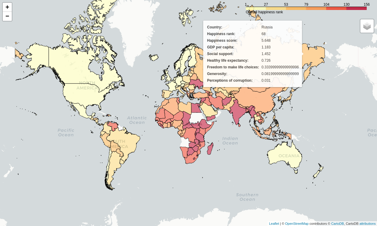 |