
diff options
| author | Christian Cleberg <hello@cleberg.net> | 2024-06-16 15:37:32 -0500 |
|---|---|---|
| committer | Christian Cleberg <hello@cleberg.net> | 2024-06-16 15:37:32 -0500 |
| commit | 77166faaf61fcb4ab05bb14f27e8cc1777a004d2 (patch) | |
| tree | 731bea70629c2635443022434db5d4f9bcfcc9a7 | |
| parent | 1b551c51a78e0de33a549692600fb677bfd69fae (diff) | |
| download | cleberg.net-77166faaf61fcb4ab05bb14f27e8cc1777a004d2.tar.gz cleberg.net-77166faaf61fcb4ab05bb14f27e8cc1777a004d2.tar.bz2 cleberg.net-77166faaf61fcb4ab05bb14f27e8cc1777a004d2.zip | |
add salary visualization tool and results
| -rw-r--r-- | content/salary.md | 13 | ||||
| -rw-r--r-- | salary_visualization.py | 56 |
2 files changed, 67 insertions, 2 deletions
diff --git a/content/salary.md b/content/salary.md index f82a2ee..2656dc1 100644 --- a/content/salary.md +++ b/content/salary.md @@ -3,7 +3,9 @@ title = "Salary" draft = false +++ -# Salary Transparency +<link rel="stylesheet" href="https://unpkg.com/charts.css/dist/charts.min.css"> + +## Salary Transparency The data below details the base salary information for each job I've held. This information is posted publicly to ensure others in my position have a solid @@ -24,7 +26,7 @@ paid differently (expertise, years of experience, certifications, education, etc.) and that the data in this table should only be used as a single point of reference, not the whole story. -# Salary Data +## Salary Data Note: When in a role that gives periodic raises, I will create a new record with the new base salary in the table below. See the KPMG records for an example of a @@ -43,6 +45,13 @@ raise while in the same role. | Teaching Assistant | University of Nebraska | Lincoln, NE | 2017-08 | 2018-05 | $7/hour | | Community Management Intern | Walgreens | Lincoln, NE | 2017-06 | 2018-02 | $14/hour | +## Salary Visualization + +See the graph below for a visualization of each job's salary over time, as well +as percentage increases or decreases between jobs. + +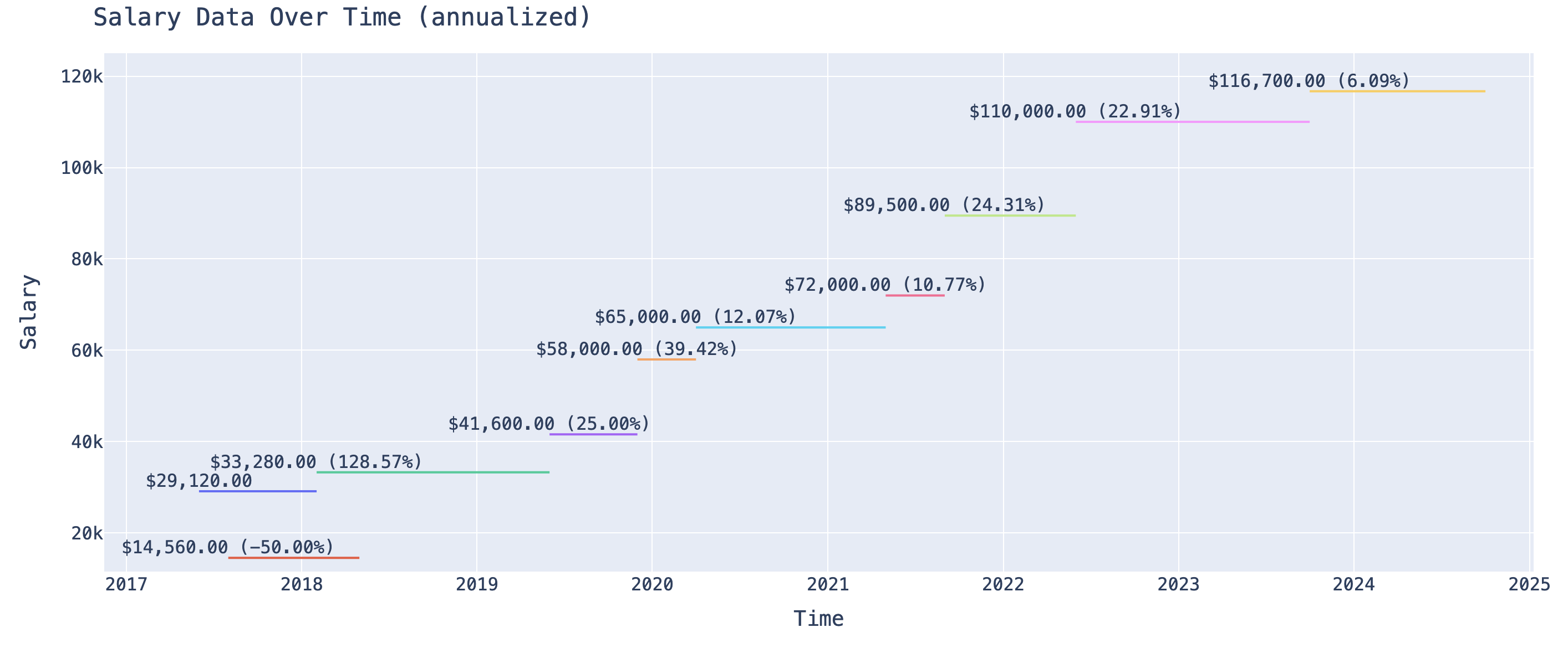 + This page was inspired by [Xe](https://xeiaso.net/salary-transparency/), and I'm quoting the following wording from them as I want to reiterate this piece: diff --git a/salary_visualization.py b/salary_visualization.py new file mode 100644 index 0000000..25d2134 --- /dev/null +++ b/salary_visualization.py @@ -0,0 +1,56 @@ +# %pip install plotly pandas + +import pandas as pd +import plotly.graph_objs as go +import locale + +locale.setlocale(locale.LC_ALL, 'en_US.UTF-8') + +df = pd.read_csv('~/Downloads/salary.csv') + +# Reverse the order of the DataFrame +df = df.iloc[::-1].reset_index(drop=True) + +# Calculate the percentage increase +df['Percentage Increase'] = df['Salary'].pct_change() * 100 + +# Initialize the plot +fig = go.Figure() + +# Adding each data point as a separate trace to display the text +for index, row in df.iterrows(): + title_company = f"{row['Title']} ({row['Company']})" + salary_formatted = format_currency(row['Salary']) + if pd.notna(row['Percentage Increase']): + text = f"{salary_formatted} ({row['Percentage Increase']:.2f}%)" + else: + text = salary_formatted + fig.add_trace(go.Scatter( + x=[row['Start'], row['End']], + y=[row['Salary'], row['Salary']], + text=[text], + mode='lines+text', + name=title_company, # Combine title and company for legend + textposition='top center' + )) + +fig.update_layout( + title="Salary Data Over Time (annualized)", + xaxis_title="Time", + yaxis_title="Salary", + font=dict( + family="monospace", + size=16 + ), + margin=dict(l=50, r=50, t=50, b=100), # Adjust bottom margin for legend space + legend=dict( + orientation="h", # Horizontal orientation + yanchor="top", # Anchor to the top of the legend box + y=-0.3, # Position below the graph + xanchor="center", # Center the legend horizontally + x=0.5 # Center the legend + ), + height=800 # Increase vertical size +) + +fig.show() |