
diff options
| author | Christian Cleberg <hello@cleberg.net> | 2024-04-29 14:18:55 -0500 |
|---|---|---|
| committer | Christian Cleberg <hello@cleberg.net> | 2024-04-29 14:18:55 -0500 |
| commit | fdd80eadcc2f147d0198d94b7b908764778184a2 (patch) | |
| tree | fbec9522ea9aa13e8105efc413d2498c3c5b4cd6 /content/blog/2024-01-27-tableau-dashboard.md | |
| parent | d6c80fdc1dea9ff242a4d3c7d3939d2727a8da56 (diff) | |
| download | cleberg.net-fdd80eadcc2f147d0198d94b7b908764778184a2.tar.gz cleberg.net-fdd80eadcc2f147d0198d94b7b908764778184a2.tar.bz2 cleberg.net-fdd80eadcc2f147d0198d94b7b908764778184a2.zip | |
format line wrapping and fix escaped characters
Diffstat (limited to 'content/blog/2024-01-27-tableau-dashboard.md')
| -rw-r--r-- | content/blog/2024-01-27-tableau-dashboard.md | 99 |
1 files changed, 48 insertions, 51 deletions
diff --git a/content/blog/2024-01-27-tableau-dashboard.md b/content/blog/2024-01-27-tableau-dashboard.md index 4761676..71721fd 100644 --- a/content/blog/2024-01-27-tableau-dashboard.md +++ b/content/blog/2024-01-27-tableau-dashboard.md @@ -5,12 +5,12 @@ description = "" draft = false +++ -In this project, I am going to show you how to use Tableau Public for -free to create simple dashboards. +In this project, I am going to show you how to use Tableau Public for free to +create simple dashboards. -I will be creating simple visuals from an Omaha crime data set and -combining them to create the dashboard below. You can view this -dashboard interactively online here: [Omaha Crime Data (2015 - +I will be creating simple visuals from an Omaha crime data set and combining +them to create the dashboard below. You can view this dashboard interactively +online here: [Omaha Crime Data (2015 - 2023)](https://public.tableau.com/app/profile/c.c7042/viz/OmahaCrimeData2015-2023/OmahaCrimeData2015-2023#1).  is a free-to-use web -application that allows you to create visualizations by uploading data -sources. Note that there\'s no way to keep the data and visualizations -private, so don\'t upload anything private. +[Tableau Public](https://public.tableau.com/) is a free-to-use web application +that allows you to create visualizations by uploading data sources. Note that +there's no way to keep the data and visualizations private, so don't upload +anything private. -After creating an account, you can click the `Create` \> -`Web Authoring` link to create your first visualization. +After creating an account, you can click the `Create` > `Web Authoring` link to +create your first visualization. 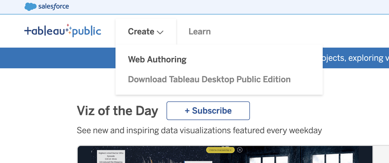 ## Upload the Data -Once you\'ve opened your first project, Tableau will ask you to connect -to your data. For this project, click the -`Upload from computer` button and select the CSV file -previously combined in the step above. +Once you've opened your first project, Tableau will ask you to connect to your +data. For this project, click the `Upload from computer` button and select the +CSV file previously combined in the step above. 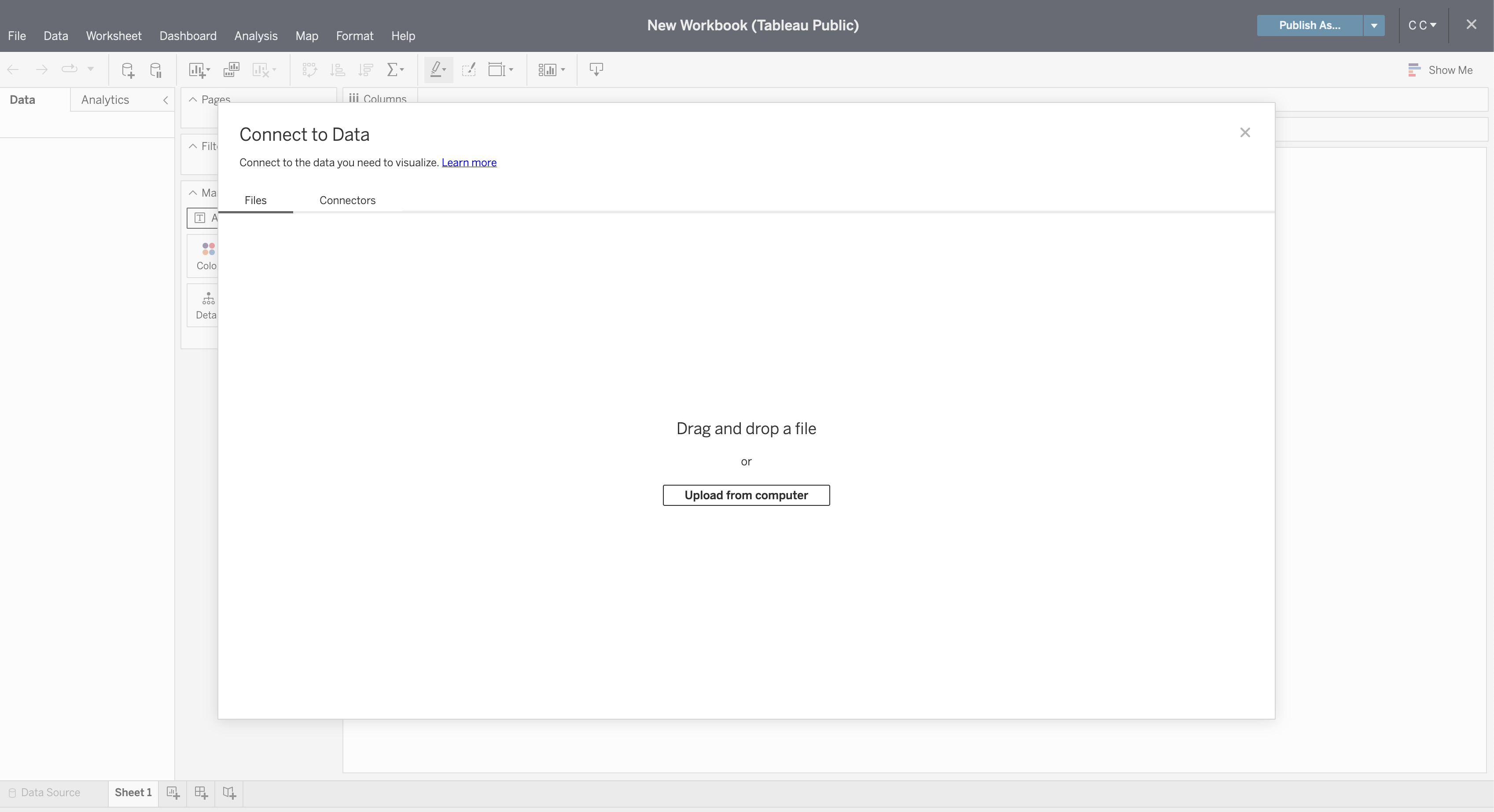 -Once connected, you can refresh the preview of the data with the -`Refresh Data Source` button in the toolbar. +Once connected, you can refresh the preview of the data with the `Refresh Data +Source` button in the toolbar. 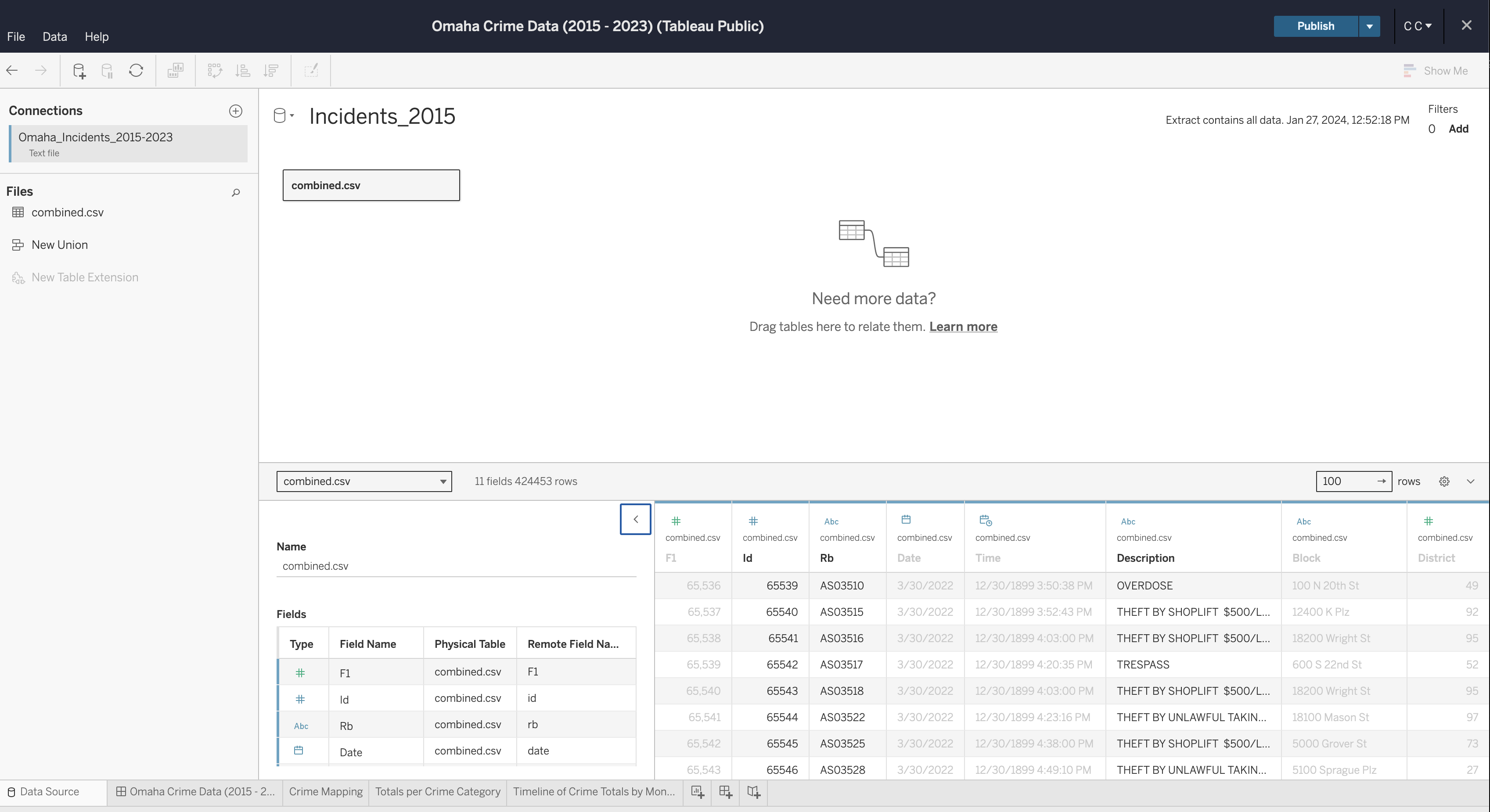 -If you need to edit any of the data types, column names, etc., you can -do so now. Once complete, generate an extract so that you can start -creating visualizations. +If you need to edit any of the data types, column names, etc., you can do so +now. Once complete, generate an extract so that you can start creating +visualizations. ## Create Visualizations To start, create a worksheet in the toolbar at the bottom of the screen. -Within this screen, select a column from the `Data` side bar -on the left and drag it into the `Columns` or -`Rows` area of the canvas. +Within this screen, select a column from the `Data` side bar on the left and +drag it into the `Columns` or `Rows` area of the canvas. See below for the map visualization. You can recreate this by adding the following fields: -- `Columns`: Lon -- `Rows`: Lat -- `Marks`: - - Description - - Datetime -- `Filters`: Datetime +- `Columns`: Lon +- `Rows`: Lat +- `Marks`: + - Description + - Datetime +- `Filters`: Datetime 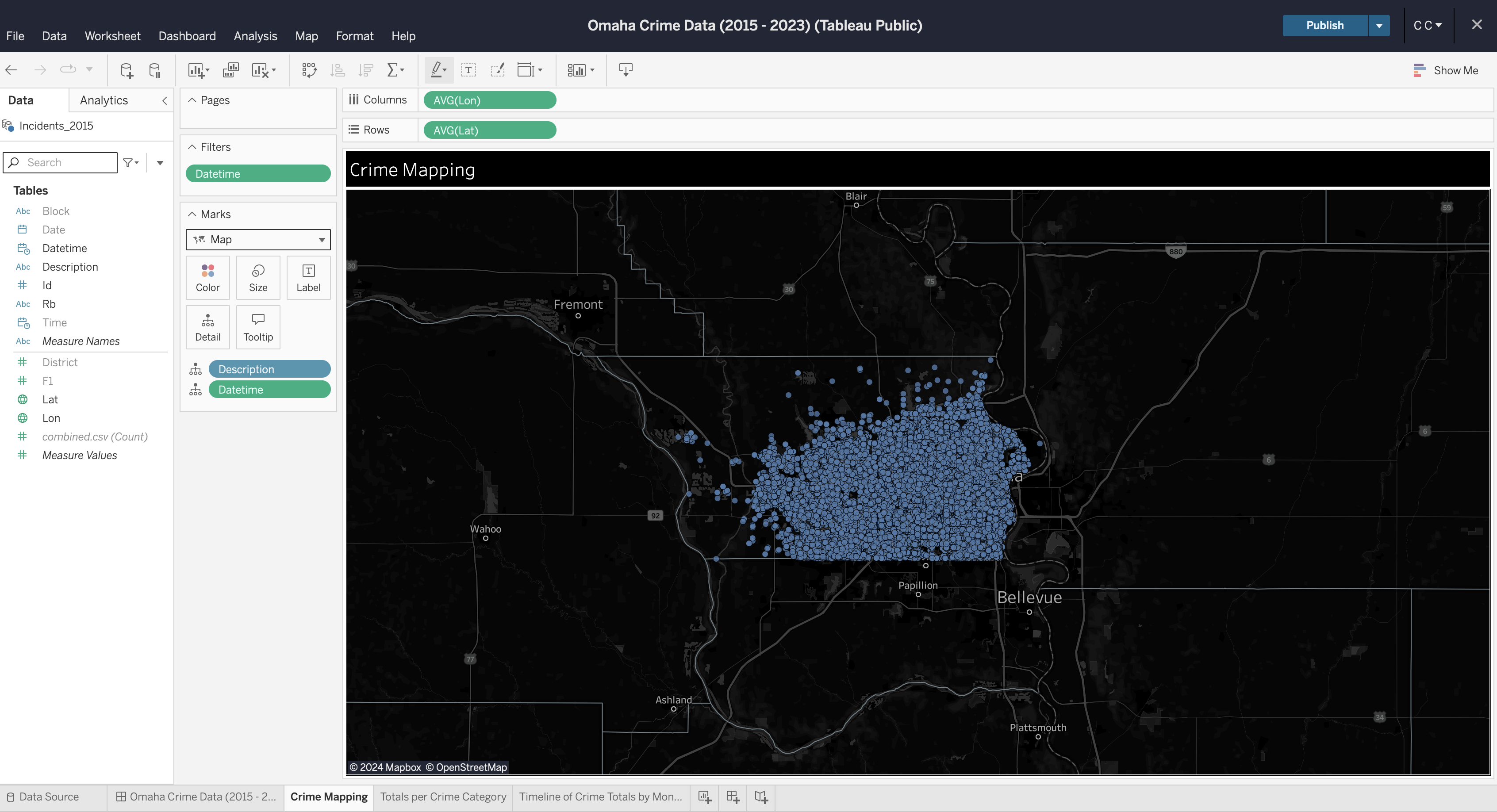 -You can repeat this process for each visualization you want to create. -Explore your options by dragging data fields to different areas and by -opening the field options to explore what operations can be performed on -different data types (e.g., average, count, etc.). +You can repeat this process for each visualization you want to create. Explore +your options by dragging data fields to different areas and by opening the field +options to explore what operations can be performed on different data types +(e.g., average, count, etc.). ## Create Dashboard -To create a dashboard, click the button on the toolbar at the bottom of -the screen. Within the dashboard, drag each sheet from the left side bar -onto the dashboard canvas. +To create a dashboard, click the button on the toolbar at the bottom of the +screen. Within the dashboard, drag each sheet from the left side bar onto the +dashboard canvas. 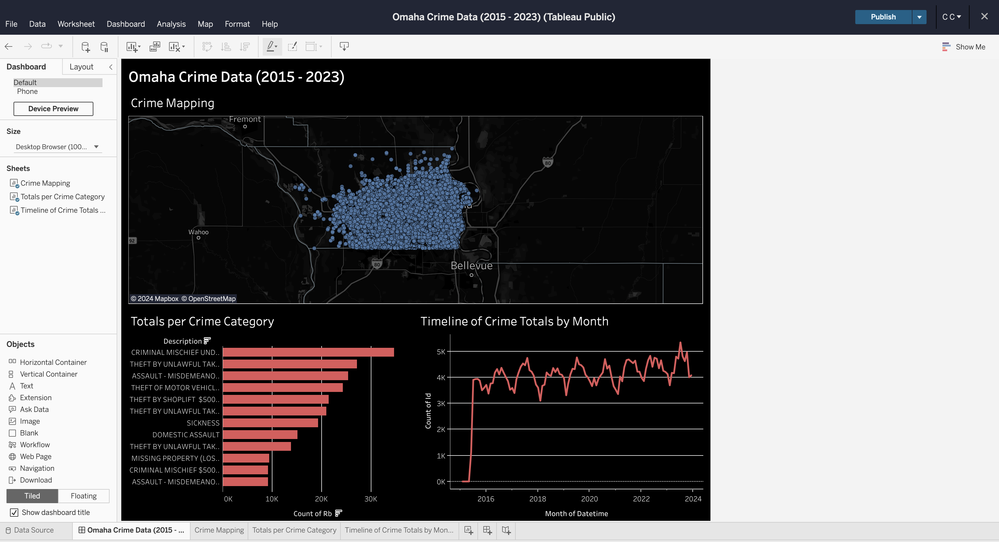 ## Formatting -You can explore a ton of different formatting options throughout the -worksheets and dashboard. Specifically for maps, you can alter the map -layers, background, and visible features through the `Map` -menu in the top file menu of the editing screen. +You can explore a ton of different formatting options throughout the worksheets +and dashboard. Specifically for maps, you can alter the map layers, background, +and visible features through the `Map` menu in the top file menu of the editing +screen. -In the finished dashboard below, I opted for a dark mode with a map that -showed county lines and city names. +In the finished dashboard below, I opted for a dark mode with a map that showed +county lines and city names. -There\'s a ton of other options available to be used in a dashboard like -this, but this project shows a quick preview of what you can do in -Tableau Public. +There's a ton of other options available to be used in a dashboard like this, +but this project shows a quick preview of what you can do in Tableau Public. 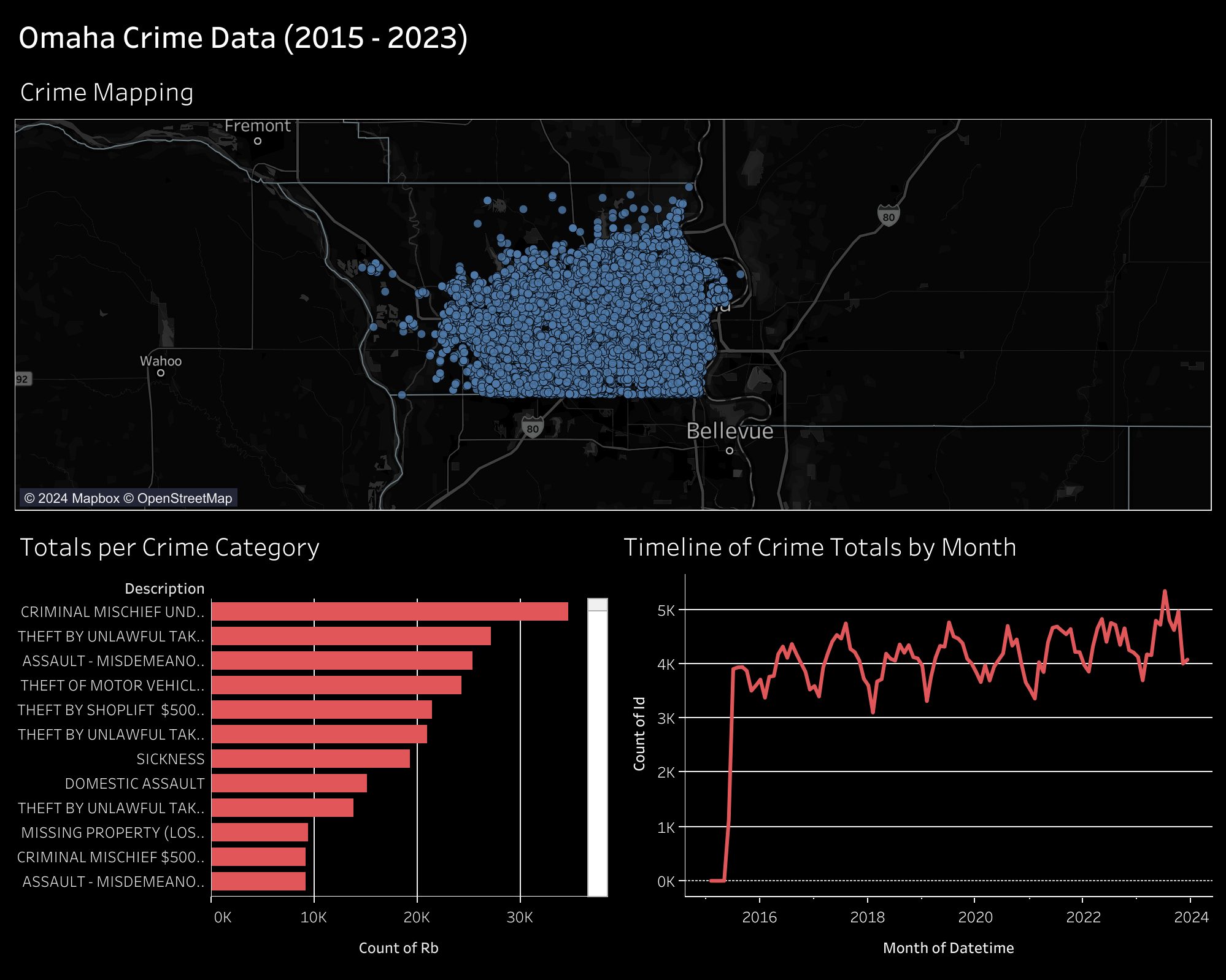 |