1
2
3
4
5
6
7
8
9
10
11
12
13
14
15
16
17
18
19
20
21
22
23
24
25
26
27
28
29
30
31
32
33
34
35
36
37
38
39
40
41
42
43
44
45
46
47
48
49
50
51
52
53
54
55
56
57
58
59
60
61
62
63
64
65
66
67
68
69
70
71
72
73
74
75
76
77
78
79
80
81
82
83
84
85
86
87
88
89
90
91
92
93
94
95
96
97
98
99
100
101
102
103
104
105
106
107
108
109
110
111
112
113
114
115
116
117
118
119
120
121
122
123
124
125
126
127
128
129
130
131
132
133
134
135
136
137
138
139
140
141
142
143
144
145
146
147
148
149
150
151
152
153
154
155
156
157
158
159
160
161
162
163
164
165
166
167
168
169
170
171
172
173
174
175
176
177
178
179
180
181
182
183
184
185
186
187
188
|
+++
date = 2024-01-26
title = "Building an Audit Status Dashboard"
description = ""
draft = false
+++
Alteryx and Power BI are powerful tools that can help turn your
old-school audit trackers into interactive tools that provide useful
insights and potential action plans.
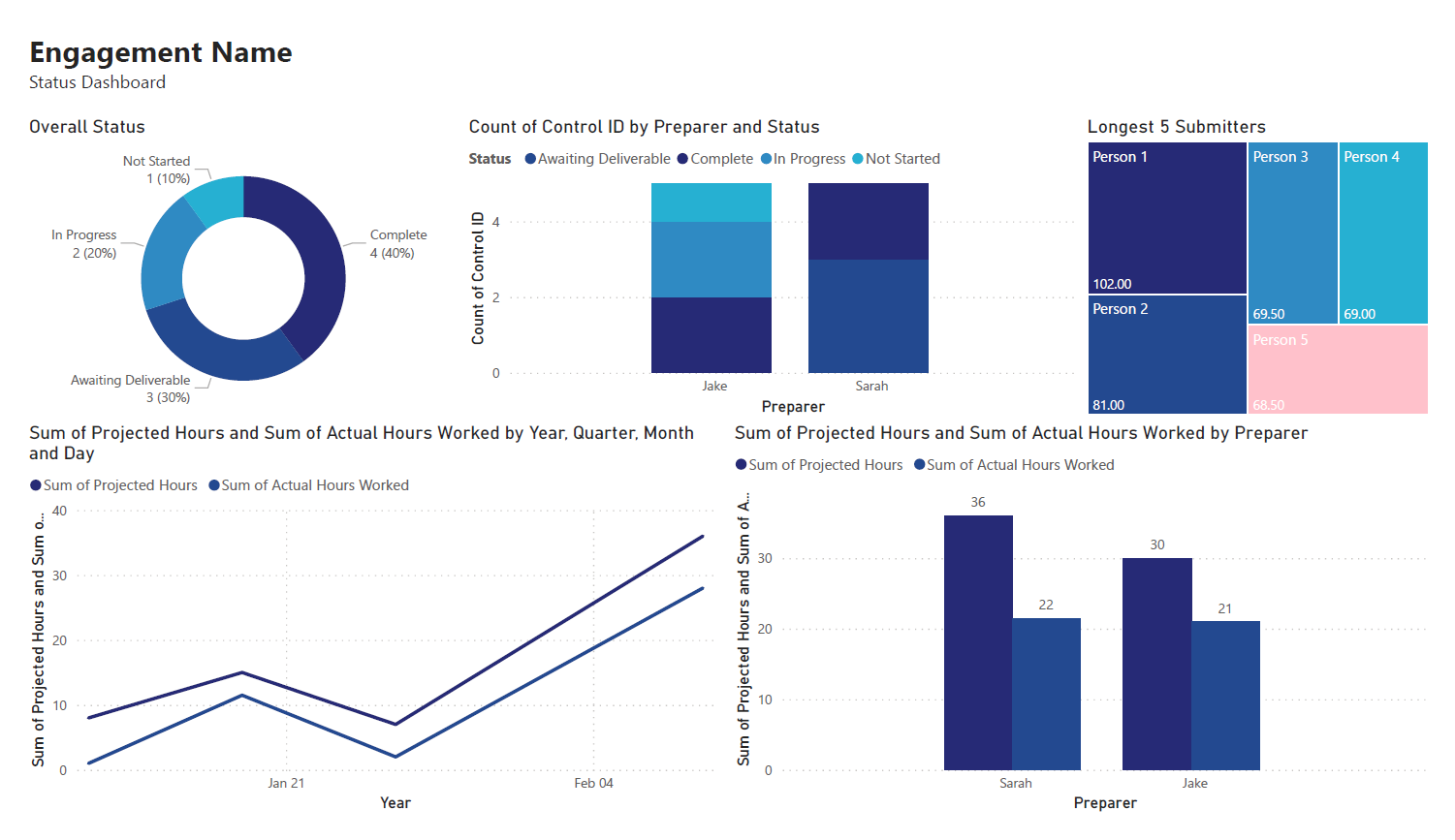
With these tools, we are going to build the following dashboard:
# Requirements
This project assumes the following:
- You have access to Alteryx Designer and Power BI Desktop.
- If you only have Power BI Desktop, you may need to perform some
analysis in Power BI instead of Alteryx.
- Your data is in a format that can be imported into Alteryx and/or
Power BI.
- You have a basic understanding of data types and visualization.
# Alteryx: Data Preparation & Analysis
## Import Data
With Alteryx, importing data is easy with the use of the
`Input Data` tool. Simply drag this tool onto the canvas from
the `In/Out` tab in the Ribbon to create it as a node.
You can choose the File Format manually or simply connect to your
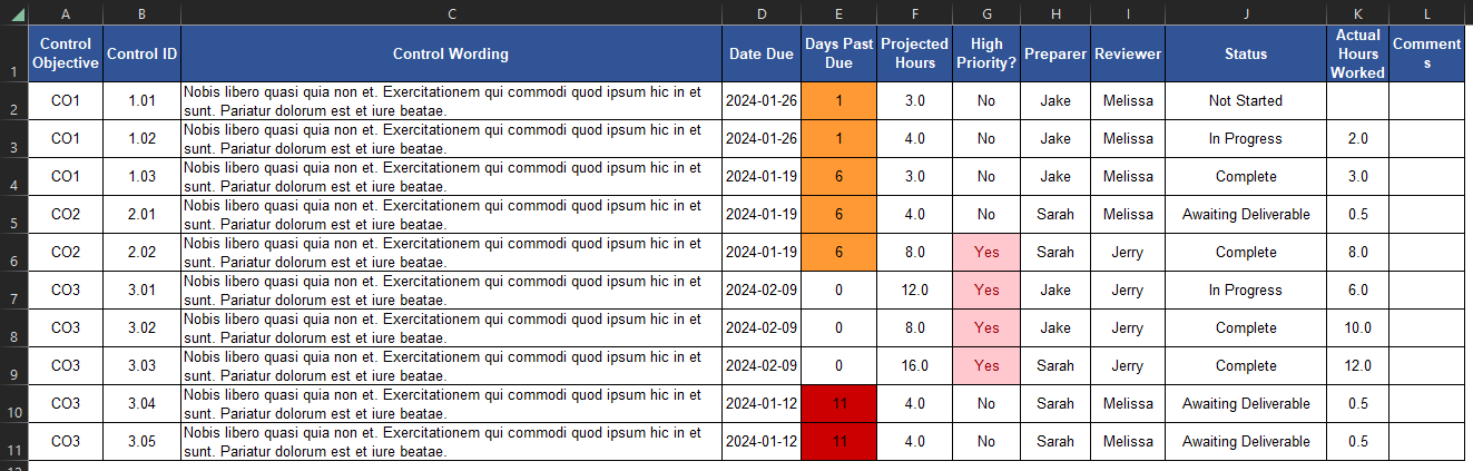
file/database and let Alteryx determine the format for you. For this
example, we will be importing an Excel file and changing the
`Start Data Import on Line` variable to `2`.

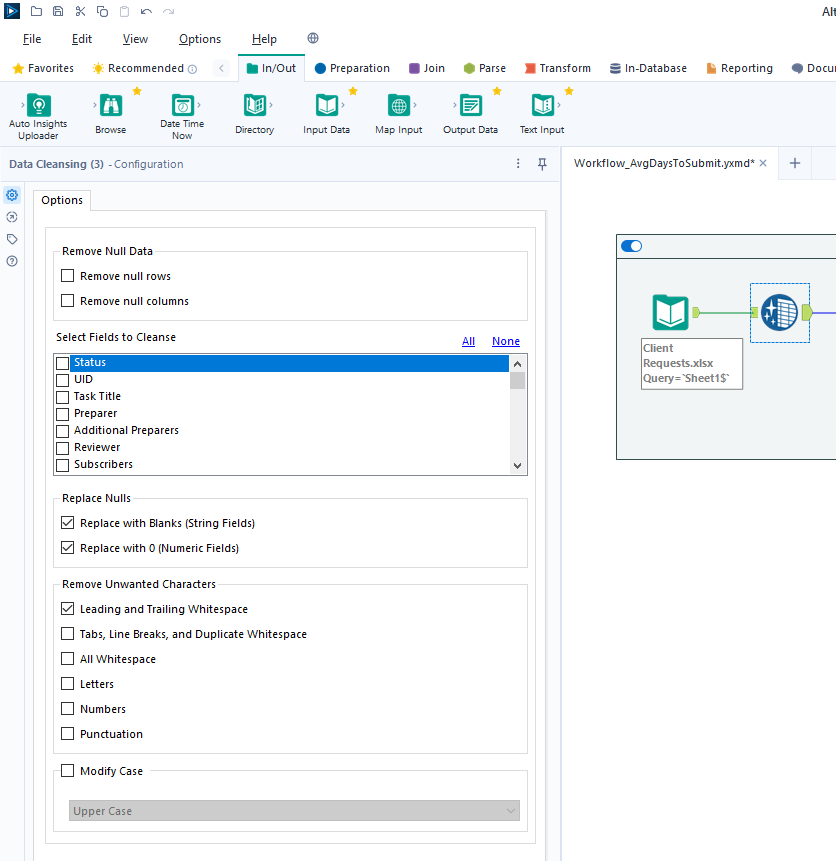
## Transform Data
Next, let\'s replace null data and remove whitespace to clean up our
data. We can do this with the `Data Cleansing` tool in the
`Preparation` tab in the Ribbon.
Ensure that the following options are enabled:
- Replace Nulls
- Replace with Blanks (String Fields)
- Replace with 0 (Numeric Fields)
- Remove Unwanted Characters
- Leading and Trailing Whitespace
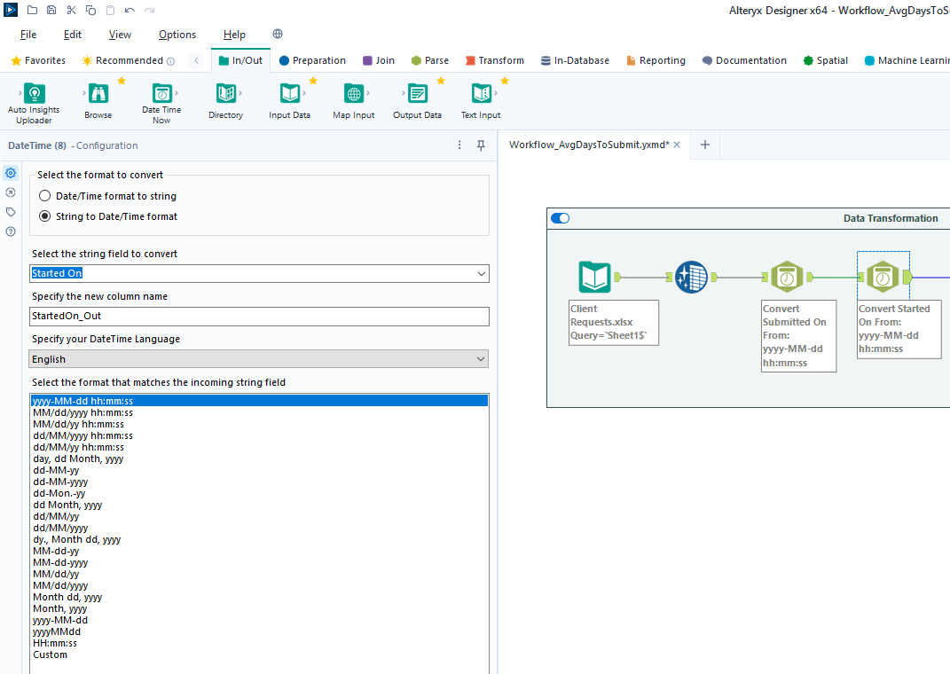
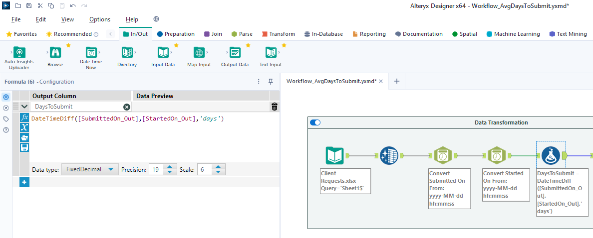
For our next step, we will transform the date fields from strings to
datetime format. Add a `Datetime` tool for each field you
want to transform - in the example below, I am using the tool twice for
the \"Started On\" and \"Submitted On\" fields.
Now that the dates are in the correct format, let\'s perform a
calculation based on those fields. Start by adding a `Filter`
tool, naming a new Output Column, and pasting the formula below into it
(the two fields used in this formula must match the output of the
`Datetime` tools above):
``` txt
DateTimeDiff([SubmittedOn_Out],[StartedOn_Out], "days")
```
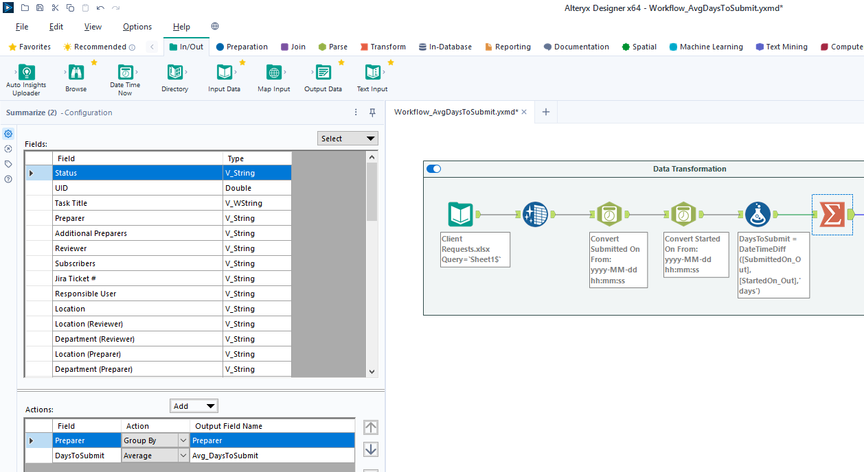
## Export Data
Finalize the process by exporting the transformed data set to a new
file, for use in the following visualization step.
# Power BI: Data Visualization
## Import Data
To start, open the Power BI Desktop application. Upon first use, Power
BI will ask if you want to open an existing dashboard or import new
data.
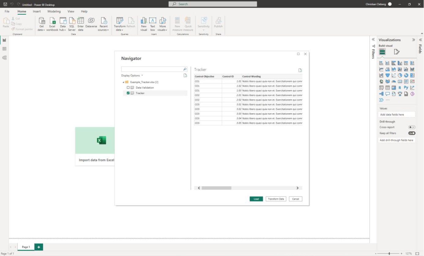
As we are creating our first dashboard, let\'s import our data. In my
example below, I\'m importing data from the \"Tracker\" sheet of the
Excel file I\'m using for this project.
During this process, I also imported the export from the Alteryx
workflow above. Therefore, we have two different files available for use
in our dashboard.
## Add Visuals
To create the dashboard below, you will need to follow the list
instructions below and format as needed:


Instructions to create the visuals above:
- `Text Box`: Explain the name and purpose of the
dashboard. You can also add images and logos at the top of the
dashboard.
- `Donut Chart`: Overall status of the project.
- `Legend`: Status
- `Values`: Count of Status
- `Stacked Column Chart`: Task count by assignee.
- `X-axis`: Preparer
- `Y-axis`: Count of Control ID
- `Legend`: Status
- `Treemap`: Top N client submitters by average days to
submit.
- `Details`: Preparer
- `Values`: Sum of Avg~DaysToSubmit~
- `Line Chart`: Projected vs. actual hours over time.
- `Clustered Bar Chart`: Projected vs. actual hours per
person.
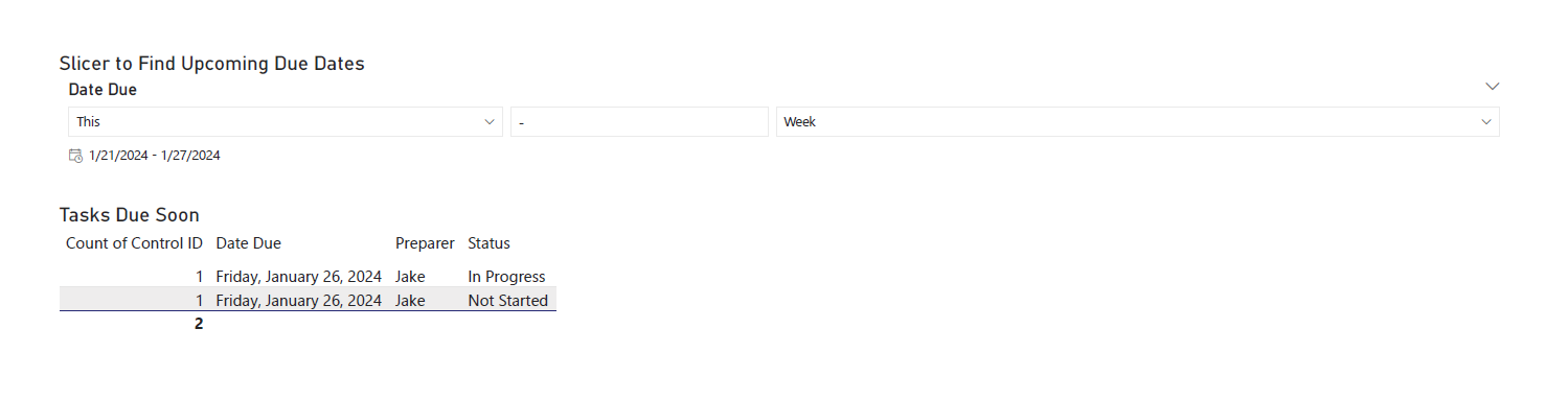
- `Slicer & Table` - Upcoming due dates.
- `Slicer`:
- `Values`: Date Due
- `Table`:
- `Columns`: Count of Control ID, Date Due,
Preparer, Status
## Format the Dashboard
You can choose a theme in the View tab of the Ribbon. You can even
browse for custom JSON files that define themes, such as ones found
online or custom ones created by your organization.
For each visual, you can click the `Format` button in the
`Visualizations` side pane and explore the options. You can
custom options such as:
- Visual
- Legend
- Colors
- Data labels
- Category labels
- General
- Properties
- Title
- Effects
- Header icons
- Tooltips
- Alt text
You can always look online for inspiration when trying to decide how
best to organize and style your dashboard.
# Sharing the Results
Generally, you have a few different options for sharing your dashboards
with others:
1. Export the dashboard as a PDF in the file menu of Power BI. This
will export all tabs and visuals as they are set when the export
button is pressed. You will lose all interactivity with this option.
2. Send the full Power BI file to those you wish to share the
dashboard. This will retain all settings and interactivity. However,
you will also need to send the source files if they need to refresh
the dashboard and you will need to re-send the files if you make
updates.
3. Store the dashboard in a synced location, such as a shared drive or
Microsoft Teams. Depending on how a user configures their local
Windows paths, the data source paths may not be compatible for all
users with such a setup.
|
